Case study
Teamspective.com: from paper to live in a month
Renewing the marketing site end to end: sketched on paper, prototyped in code, no Figma in between.
- Year
- 2025
- Role
- Design & development
- Client
- Teamspective
- Stack
- Astro, Svelte, TypeScript, Sanity
Context
My first project after joining Teamspective was the marketing website. The existing site no longer reflected where the product was heading (an AI‑native leadership enablement platform), and a launch was on the horizon. I owned the whole thing: the planning and PRD, structure, branding, visual design, copy structure and the build. From the first line of the PRD to production in one month.
Start with the why, on one page
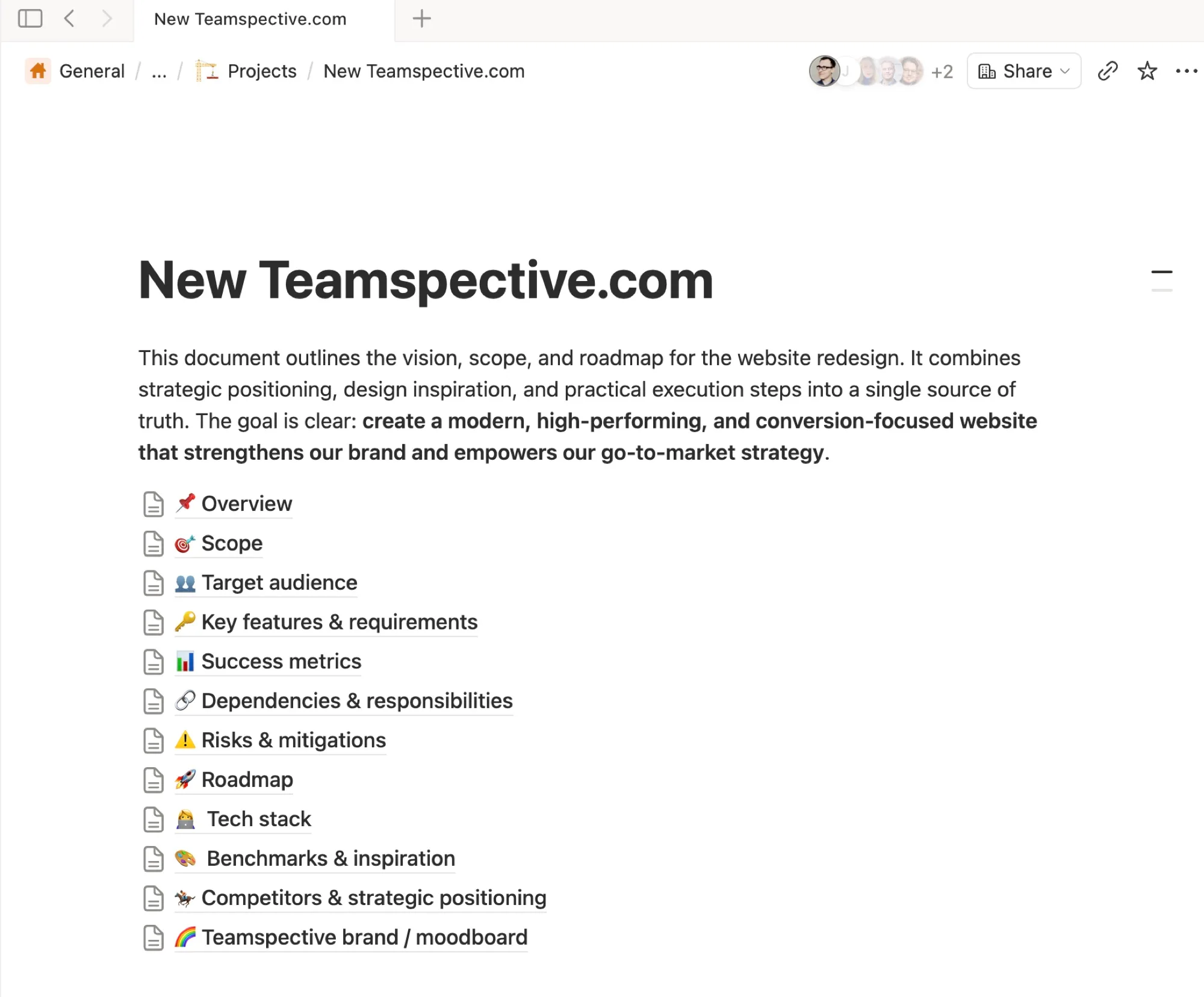
Before any sketching, I wrote the PRD: a single Notion document the whole team could read in ten minutes. It set the goal (a modern, high‑performing, conversion‑focused site that strengthens the brand and powers go‑to‑market) and then answered the questions that otherwise resurface in every review: scope, target audience, key features and requirements, success metrics, dependencies and responsibilities, risks and mitigations, roadmap, tech stack, benchmarks and inspiration, competitors and positioning, and the brand moodboard.
It’s the least glamorous part of the month and the reason the rest went quickly: once the why and the constraints were agreed in writing, sketches and prototypes could be judged against them instead of against taste.
Paper → prototype, no Figma
With the PRD agreed, this project settled a workflow I now prefer for most design work: sketch on paper, then go straight to a coded prototype.
Paper is the fastest way to visualise an idea and, more importantly, its alternatives. A few pages of rough boxes are enough to walk the team through the whole page, argue about what goes where, and get buy‑in before anything is “designed”. Nobody mistakes a pen sketch for a finished decision, so the feedback stays about structure, not pixels.
Once the structure holds up, I skip the high‑fidelity mockup and build the prototype in the real stack. Real type, real spacing, real motion, real content lengths: the things that a static mockup gets wrong anyway. From there it’s iteration in code until it’s live.
Sketch to live
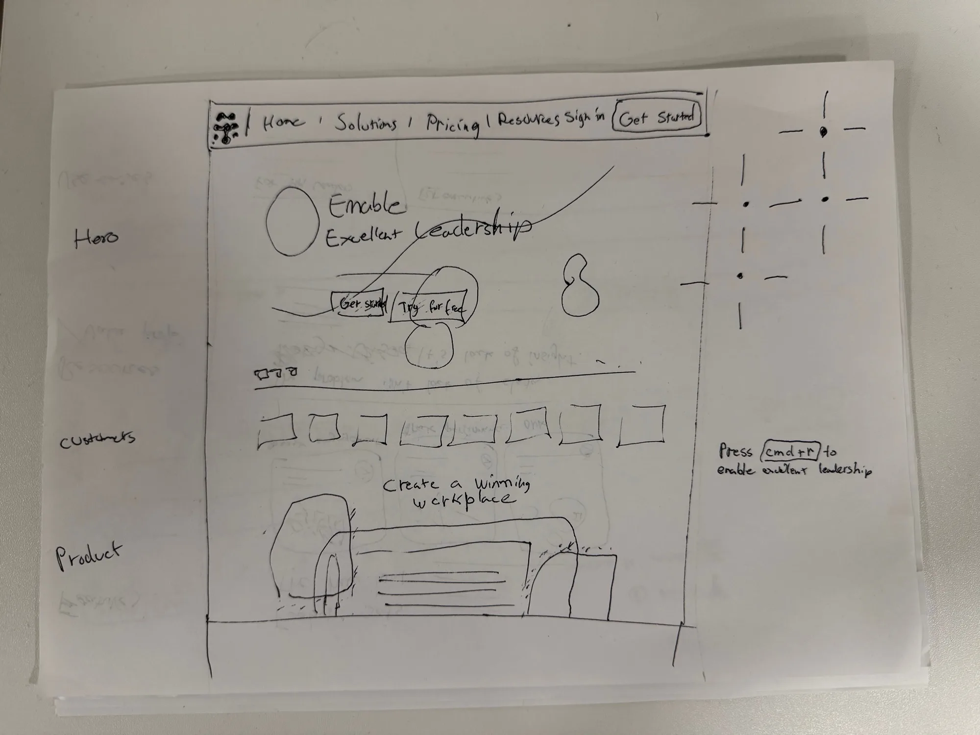
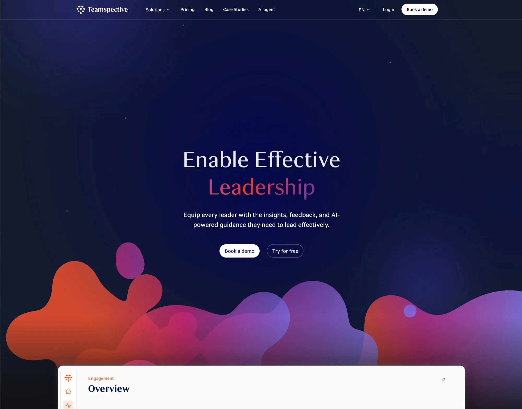
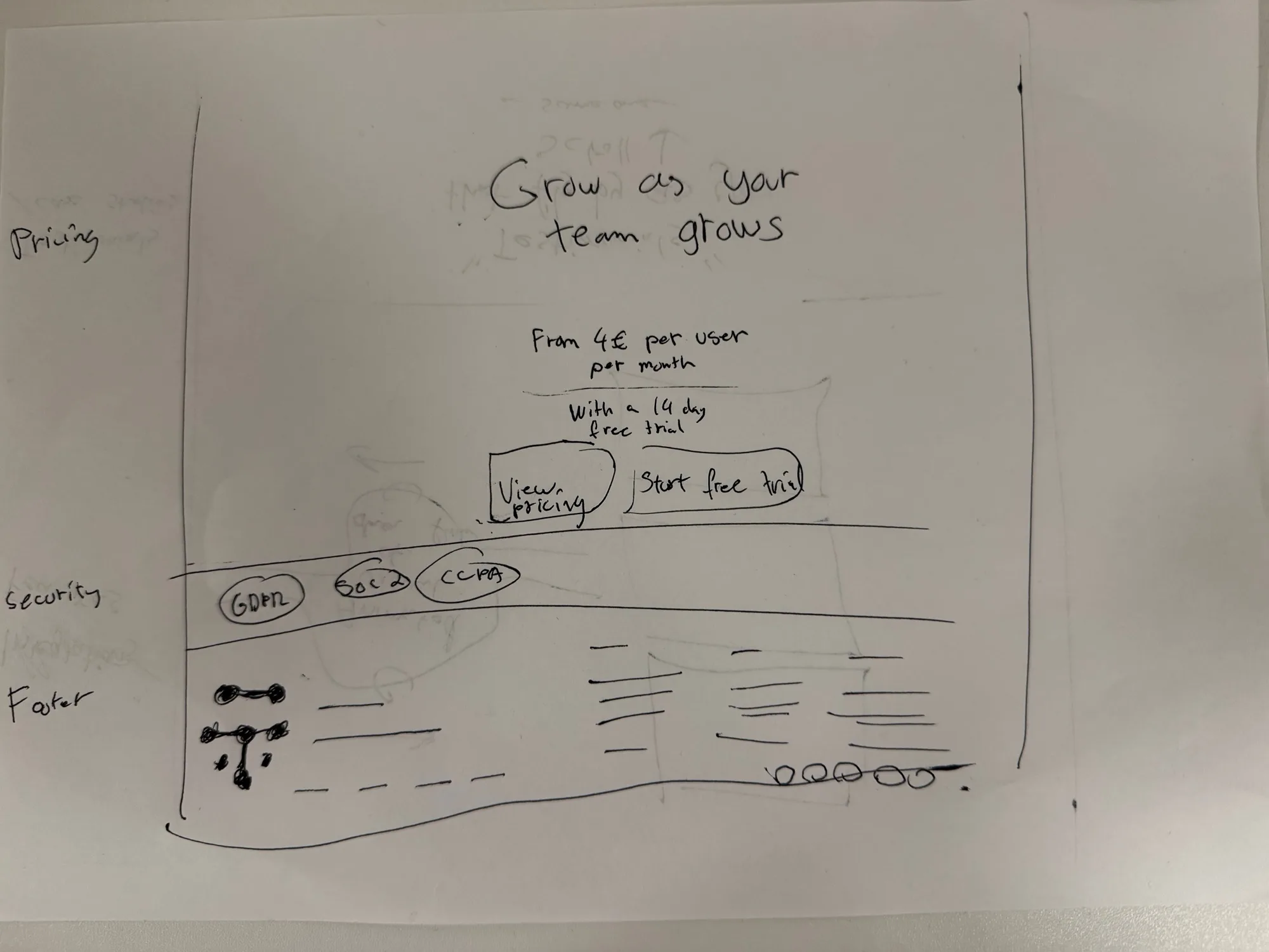
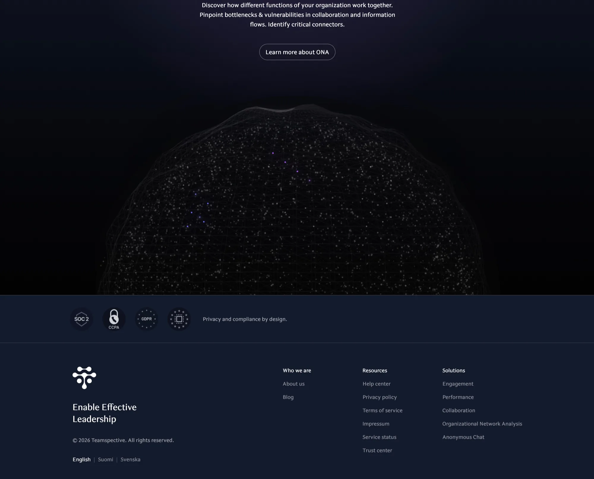
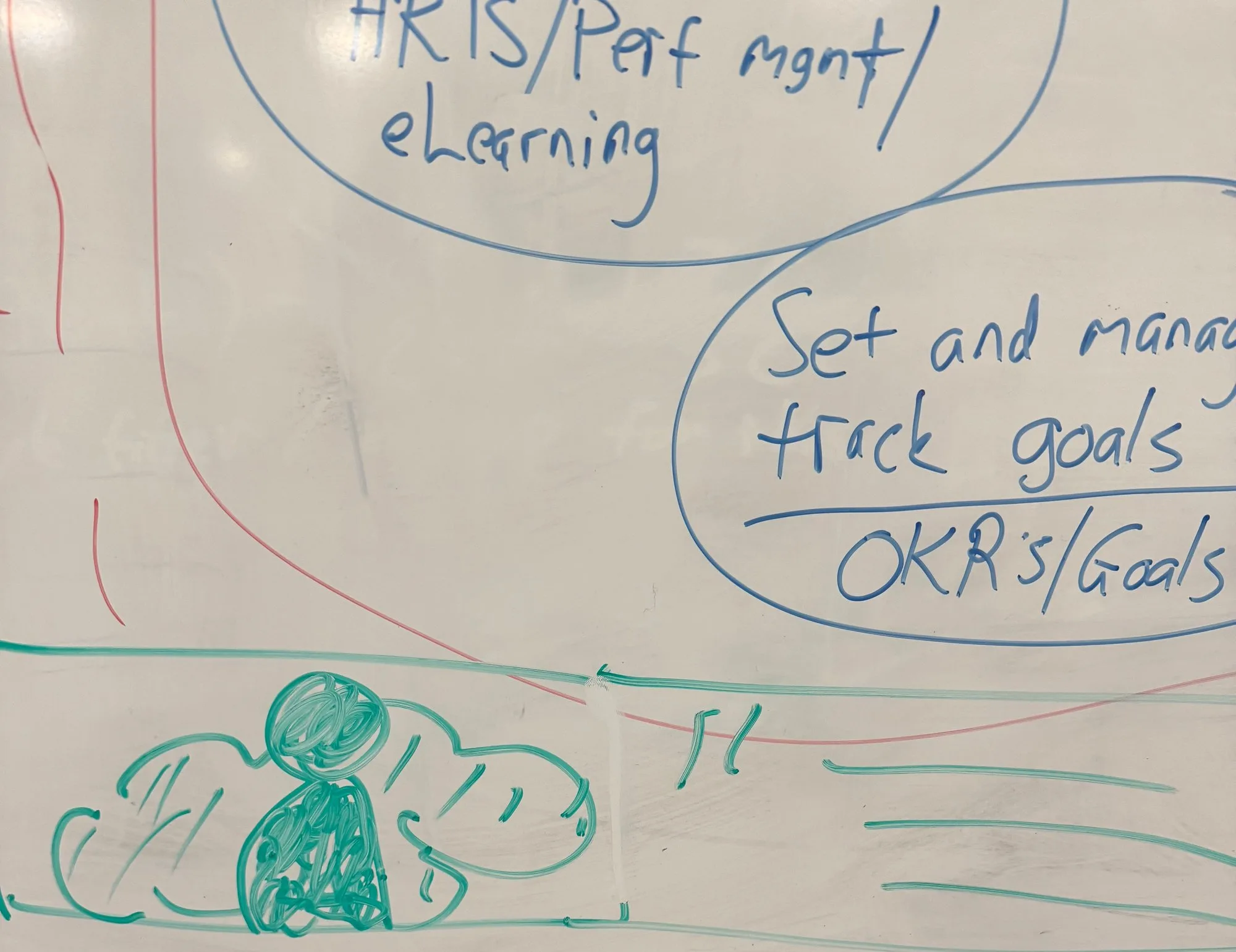
Each screen below pairs the original paper sketch with the section as it shipped.
Paper: hero
Live
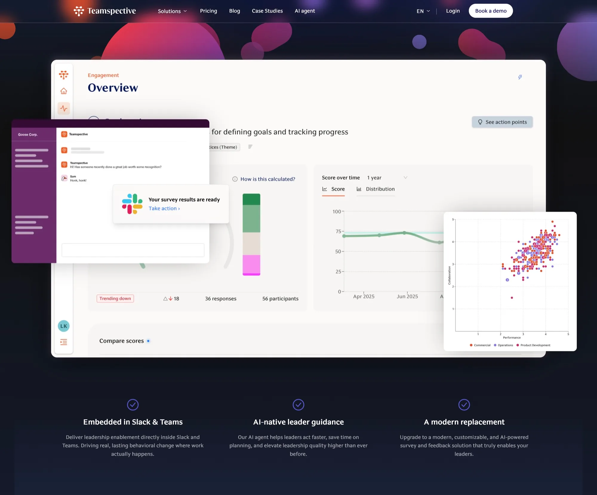
Paper: security & footer
Live
Whiteboard: the visual
Live
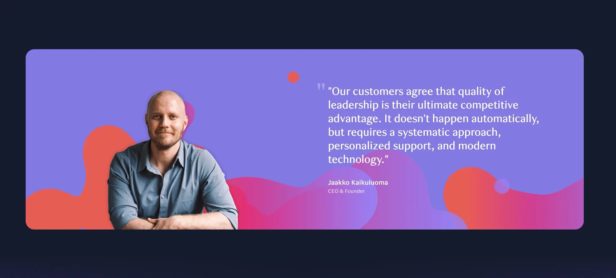
Same concept, different implementation.
Built for the team to ship, not just for launch day
A marketing site is only “done” until the next case study, pricing change or campaign. So the second half of the project was making sure nobody needed me to publish.
The site is backed by Sanity with a block‑based page builder. Every page is a stack of blocks (customer story, stats, rich text, media, company profile, step lists, comparison pairs), and each block has a small set of variants that map straight onto the design tokens: colour (white, beige, lavender, dark, purple band) and width (rail, mid, wide). The constraints are the design system; the freedom is in how you sequence them.
Editors work in Sanity’s Presentation mode with a live preview of the real site, so a draft case study looks exactly like it will when published, including the motion.
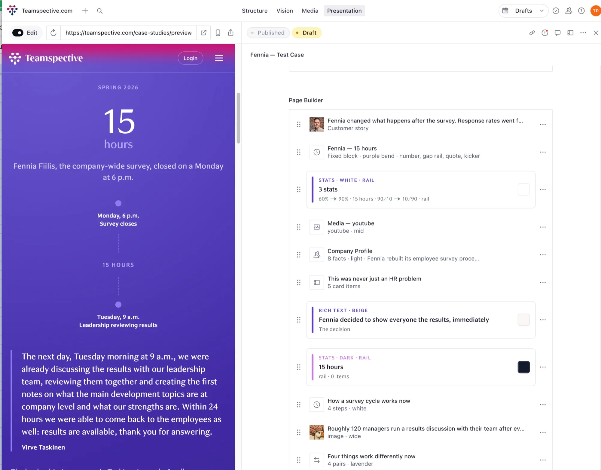
Build
- Astro + Svelte. Mostly static pages with interactive islands only where they earn their place, which is why the site is fast by default.
- Tokens first. Colour, type, spacing and motion as a small set of tokens; the Sanity block variants are those tokens exposed to editors, so new pages stay on‑brand without a designer in the loop.
- Sanity as the content layer. Structured content, a page builder of typed blocks, and Presentation mode for live visual editing with drafts and publishing.
- Motion with restraint. The gradient shapes and reveals are there to give the product story rhythm, not to show off.
Outcome
A site the team could ship from on launch day, a design language the product has since grown into, and a working method I’ve kept: paper for thinking, code for deciding.